For years, I’ve kept a pretty spare iOS homescreen. Two or three rows of icons on the top of the screen, sometimes arranged in such a way that the app icon colors complement each other, and three apps in the dock. Because of Apple’s resistance to letting its users muck with the homescreen’s look and feel, I haven’t been able to make things quite as simple as I would like.
Apple is finally embracing Android’s chaos

I’ve looked at more customizable Android homescreens with jealousy. I’ve had an iPhone since the day the first one came out, and while Apple’s smartphones have since become wildly more powerful, capable, and larger, the company has forced me to organize my apps starting from the top of the screen for 17 years.
Sure, my homescreen usually looked nice. But I’ve wanted options to add more of my own flair to my homescreen that I see dozens of times a day — the types of tools Android users have had for a very long time — even if it meant I’d make my phone look worse. iOS 14’s widgets were a step in the right direction, and with some Siri Shortcuts wizardry, you could do a fair amount of theming.
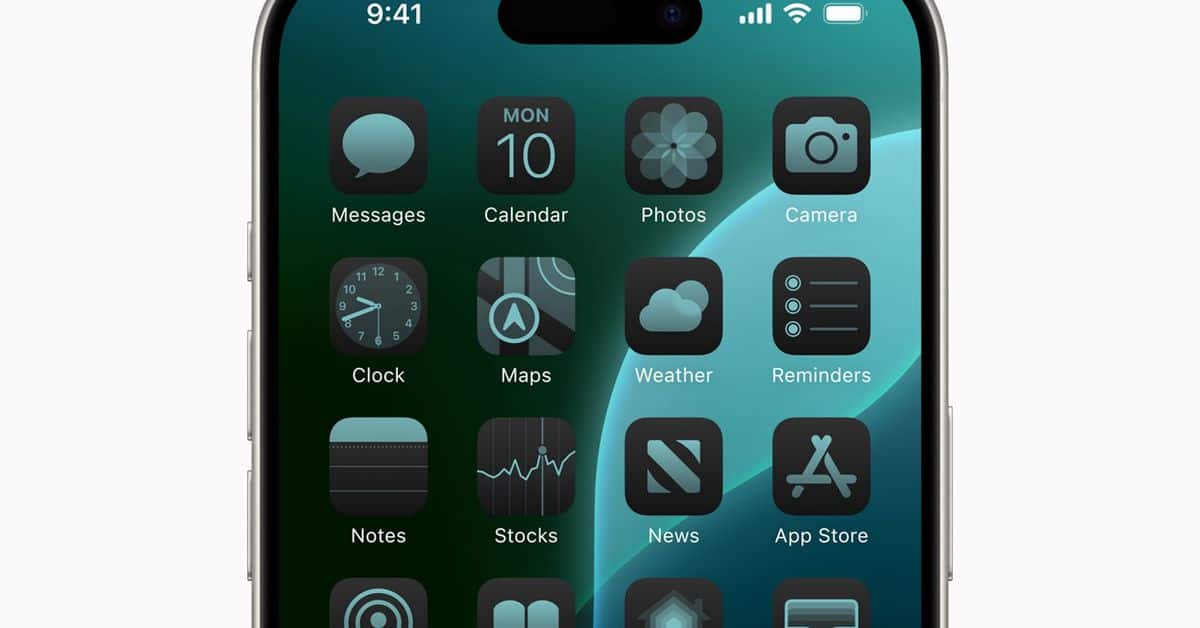
But iOS 18, the dam is finally breaking loose: as part of the new software update, Apple gives users some tools to easily customize the app icons on their homescreen, no jailbreaking or Siri Shortcuts required. You’ll be able to make all of your apps the same general color with a tinting tool, and icons can get dimmer when you flip to dark mode. You can also — again, finally — put your app icons wherever you want, meaning you can make them easier to reach or arrange them so they better fit with your wallpaper.
How did I use these newfound powers? At long last, I could make my dream minimalist homescreen.
I love it. It’s how I’ve wanted to design my iOS homescreen for years: a few apps within easy reach of my thumb with little else to clutter things up. Best of all, it only took a few minutes to put together.
Let me break it all down.
First, I immediately made my app icons gray and boring so they would match my gray and boring wallpaper. The gray tint makes apps harder to discern from one another, and that’s the point: I wanted to add some friction to my phone so that I don’t waste as much time on it.
Then, I moved my apps from the top of the screen to the bottom. This makes them more accessible when I need them on my iPhone 12 Mini. (I can see this being really useful with a Plus or Pro Max iPhone.) An unexpected benefit has been that any new apps I download are added to the top of the screen, where they stick out.
I’ve already gone on the record about how I try to have as few apps on my phone as possible. Any apps hanging out at the top of my screen are glaring reminders that I need to organize them into my homescreen, shove them into my App Library, or delete them from my phone. (Usually, it’s the latter.)
I also hid the labels on my apps so there’s basically no text on the screen. I wish I could remove the word “Search” from the button above the dock so there would be no words at all. Maybe we’ll get that by iOS 36.
I use grayscale, too
I’ve used iOS 18’s new Control Center features to make my phone more boring, too. You can now make a native toggle for the Color Filters accessibility setting, which I turn on to make everything on my phone grayscale. I’ve found this makes my phone less interesting, and I take the gray as a visual cue that I should be doing something else instead of using my phone. But when I want to see a photo of my kid in full color for just a second, I can press the toggle to turn the grayscale off.
Yes, the changes I’ve made are ugly and sometimes irritating. But they’re my choices, and I’m happy Apple has given me these tools at all. People put oddball stuff on the outside of their phones all the time, and with iOS 18, that chaos can bleed over to what’s on their homescreens. When the update comes out for everyone this fall, I’m expecting an explosion of delightful and wacky designs.
And if I get tired of my grayscale, minimalist iPhone? It’s easier than ever to make something new.
For years, I’ve kept a pretty spare iOS homescreen. Two or three rows of icons on the top of the screen, sometimes arranged in such a way that the app icon colors complement each other, and three apps in the dock. Because of Apple’s resistance to letting its users muck…
